Timeline
2 Weeks, 2024
Role
UI/UX Designer, Researcher
Tools Used
Figma
ATOM Myanmar is a leading telecommunications company in Myanmar. Following the 2021 Myanmar coup d'état, Telenor divested its local operations, transferring ownership to a joint venture and the company was officially rebranded as ATOM on June 8, 2022. This redesign project was carried out as a collaborative group effort, with each team member taking on specific responsibilities across research, strategy, and design.


The existing ATOM app presented several usability challenges:
The interface was cluttered and visually overwhelming, making it difficult for users to quickly access key services and information.
Important features were either hard to find or completely missing, leading to a frustrating user experience.
Users expressed dissatisfaction with the overall design and functionality, impacting engagement and brand perception.
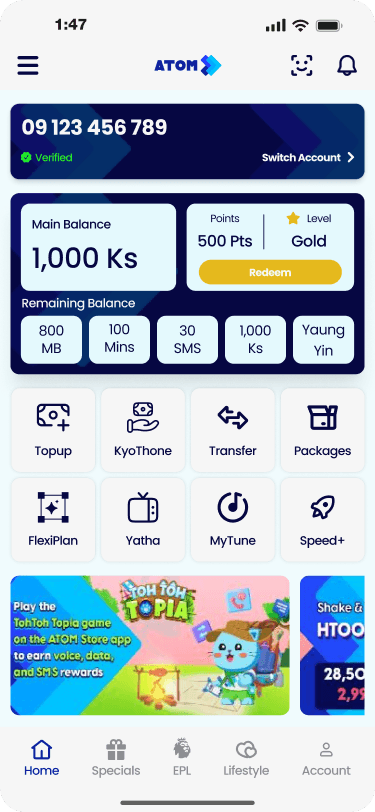
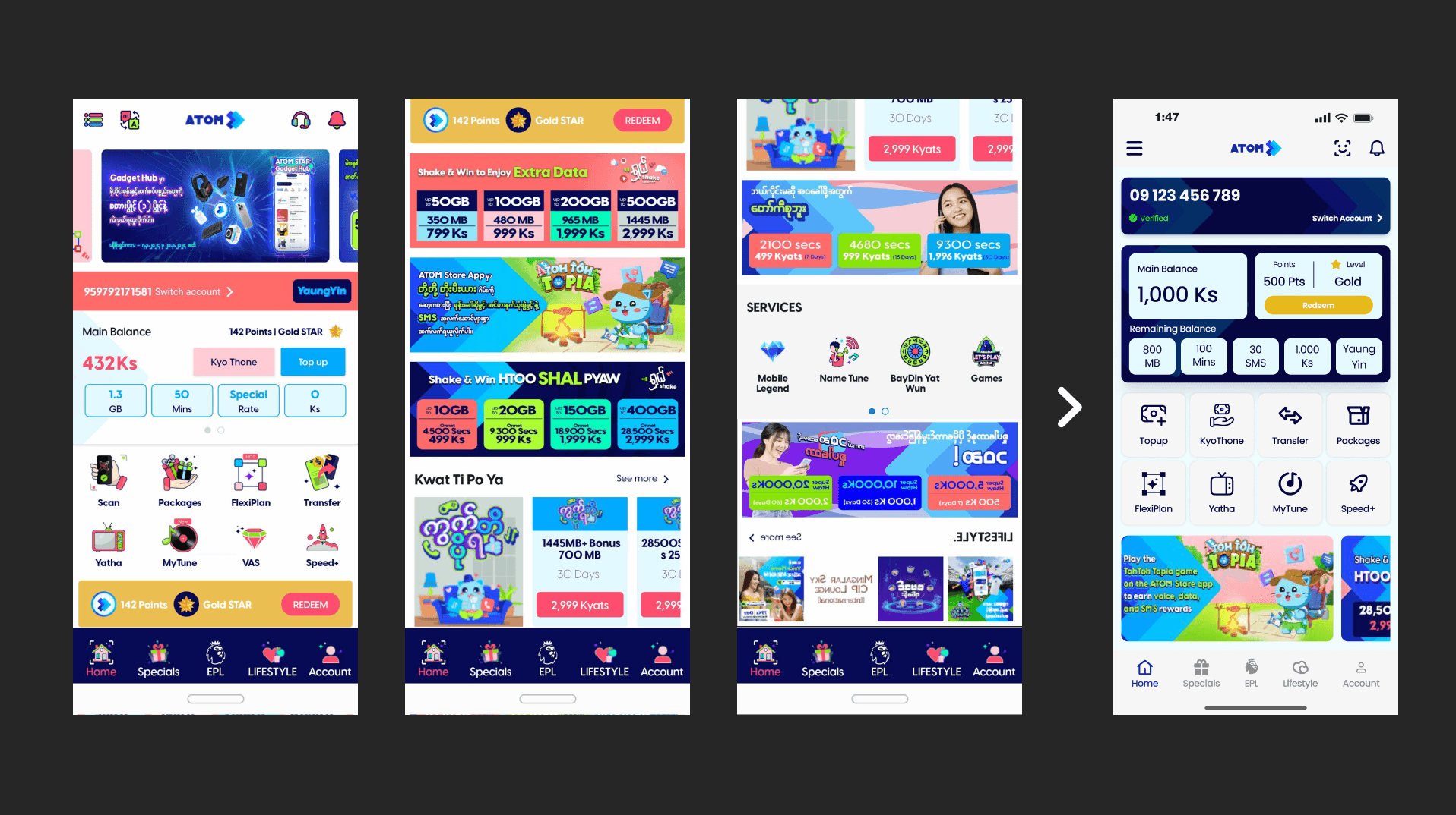
Clear visual hierarchy with reduced color noise
Fixed header for quick access to balance and top-up
Simplified navigation with grouped services
Dedicated sections for promotional content
Core user actions surfaced directly on the home screen
User Research & Insights
Collected feedback from ATOM users to identify pain points and feature expectations.
UI Simplification
Redesigned the interface with a cleaner layout, clear visual hierarchy, and improved accessibility.Feature Enhancement
Proposed high-impact features aligned with core telecom use cases and user needs.Team Collaboration
Worked in a cross-functional team covering research, wireframing, visual design, and prototyping.
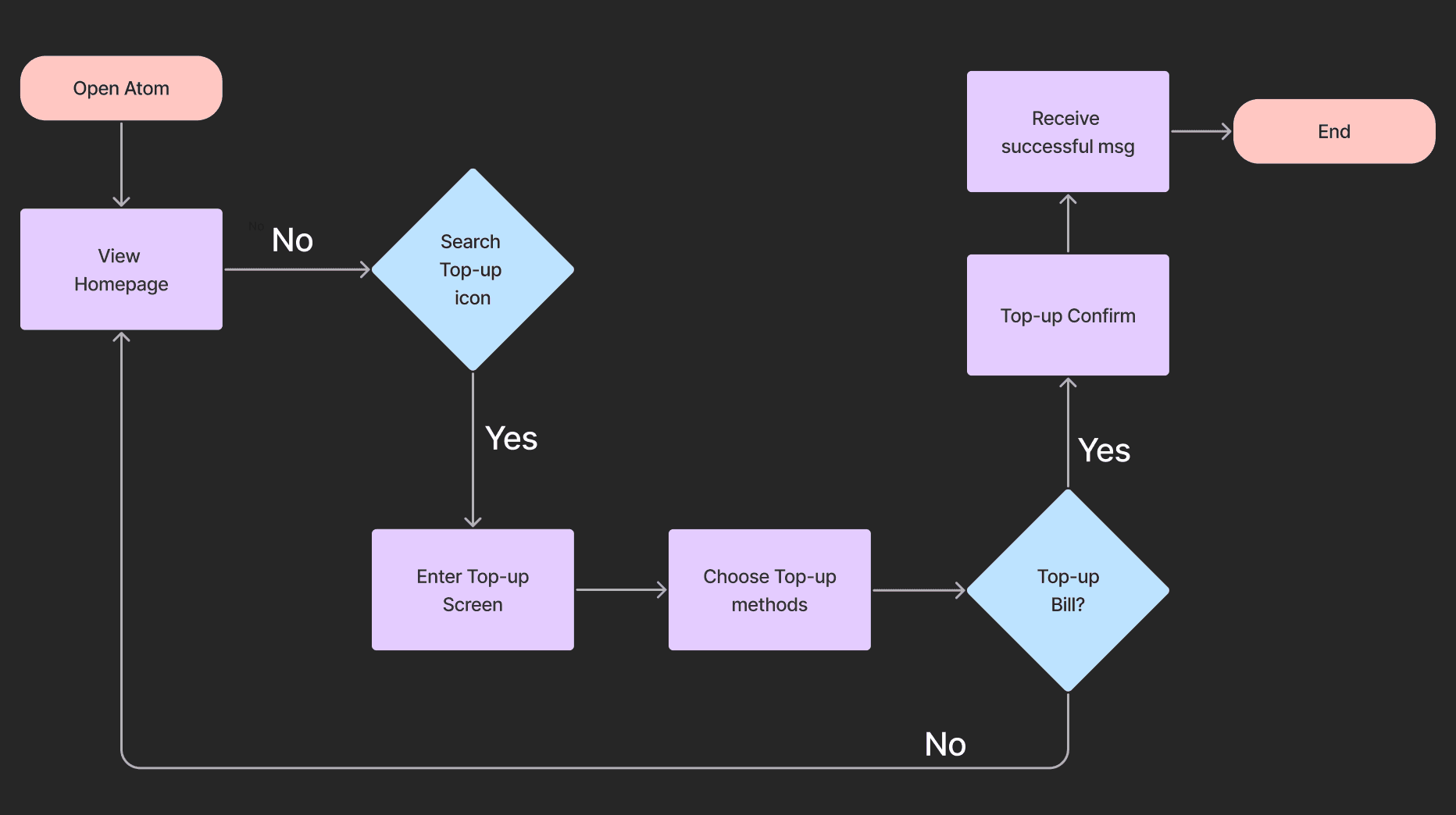
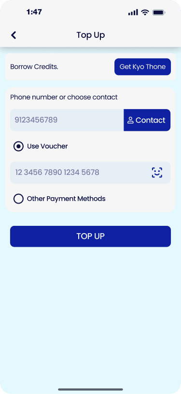
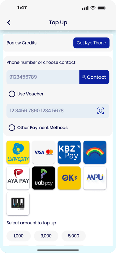
The top-up user flow was designed to reduce friction and enable quick task completion. Users can access the top-up action directly from the home screen, choose a preferred payment method, confirm the transaction, and receive clear success feedback. Each step is structured to be intuitive and predictable, ensuring users can recharge their balance with minimal effort and without confusion.
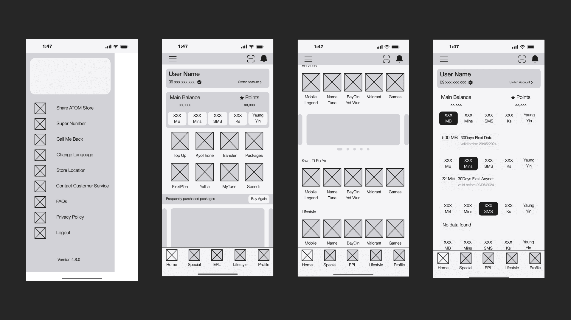
UX Pain Points in the Original Design
Overloaded Interface
Too much information was presented at once, leading to cognitive overload and reduced task efficiency.
Weak Visual Hierarchy
Balances, promotions, and services competed for attention without clear prioritization or logical grouping.
Non-Intuitive Navigation
Critical actions like balance checks and data usage were not immediately visible or easy to access.
Redundant Content Blocks
Repeated banners and decorative elements distracted users from functional areas and lowered overall usability.
Design Objectives
Establish a clear visual hierarchy to improve focus and scannability
Create a modern, streamlined layout aligned with telecom app best practices
Improve navigation for faster access to essential features
Introduce consistent iconography, spacing, and typography for better readability
Deliver a more premium, user-centered visual experience
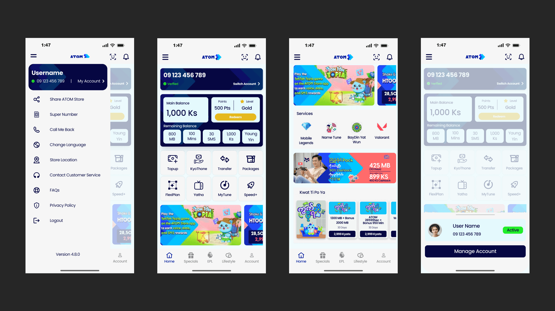
Header Optimization
Key information such as phone number, balance, and top-up actions are consolidated into a fixed, always-accessible header.
Simplified Navigation
Services are grouped under clearly labeled icons, improving discoverability and reducing decision time.
Structured Content Layout
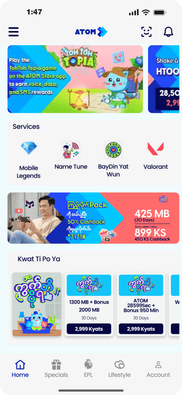
Promotional content is moved into designated sections, supporting user goals without overpowering core functionality.
Cleaner Visual Language
Reduced color noise with a controlled, brand-aligned palette
Consistent spacing, icon styles, and font weights guide users naturally through the interface
Prioritized User Tasks
Essential actions—checking data usage, recharging balance, and viewing history—are surfaced directly on the home screen for quick access.