Timeline
3 Days
Tools Used
Adobe Illustrator
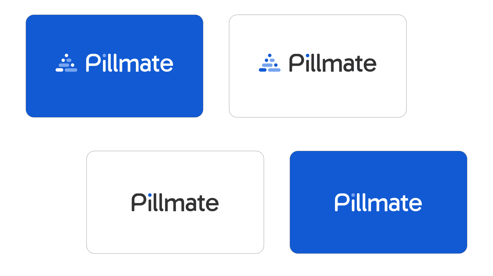
The Pillmate logo is a thoughtful representation of the brand’s mission helping users manage their medications reliably and compassionately. From the first sketch to the final icon, each element was designed with purpose and meaning, ensuring the identity communicates trust, structure, and everyday usability.


Seven Comparments
The triangular arrangement of dots directly references the 7-day pill organizer, a familiar tool used by many to manage medications. This shape serves as a visual metaphor for consistency and routine two qualities central to health management. The stacked layout also hints at progression and order, reinforcing the idea of taking medication step by step, day by day.
Capsule & Tablet Form
Each dot and line mirrors the shape of capsules and tablets, bridging the logo to its pharmaceutical context. This subtle visual language ensures the logo is instantly relevant to the product, making it memorable and meaningful to users of all ages. These forms also emphasize Pillmate’s commitment to designing features grounded in real-life medication habits.
People & Community
The way the shapes are arranged can also be seen as a group of people in connectionsignif ying empathy, support, and care. This abstraction hints at Pillmate not only as a personal tool, but as a companion in the user’s health journey, reinforcing emotional connection and user trust.
Bell for Reminder
The overall triangular structure resembles a bell, a timeless icon used for alerts and reminders. This is directly aligned with one of Pillmate’s core features smart, reliable medication notifications. The bell also evokes a sense of urgency and attentiveness without being aggressive, making the logo feel helpful and reassuring.