ATOM
ATOM Myanmar is a leading telecommunications company in Myanmar. Following the 2021 Myanmar coup d'état, Telenor divested its local operations, transferring ownership to a joint venture and the company was officially rebranded as ATOM on June 8, 2022. This redesign project was carried out as a collaborative group effort, with each team member taking on specific responsibilities across research, strategy, and design.
Timeline
3 Weeks, 2024
Role
UI/UX Designer, Researcher
Used Tools
Figma, Notion
Leveraged Skills
User Research, User Experience, User Interface, Wireframing, Prototyping
Core Problems
ATOM is one of Myanmar's leading telecom providers, yet its mobile app was failing the users it was built for. Despite a large user base, the experience felt cluttered and difficult to navigate especially for users completing high-frequency tasks like topping up credit or checking their data balance. The app's information architecture made simple actions harder than they needed to be, and the visual design lacked the hierarchy needed to guide users confidently through the interface.
Our Approach
Research & Insights
I began by identifying how existing ATOM users interact with the app and where they drop off. Research revealed three consistent pain points navigation that required too many taps to reach core features, inconsistent visual hierarchy that made the interface feel overwhelming at a glance, and button and element sizing that didn't account for one-handed use or accessibility needs.
Design Objectives
With those insights as a foundation, the redesign was guided by four goals: simplify navigation to reduce cognitive load, restructure the information hierarchy so the most important content leads, improve touch targets for better usability across all device sizes, and establish a cleaner visual language that builds trust and clarity throughout the experience.
Solutions
Rather than a surface-level visual refresh, the goal was to rethink how users move through the app. The redesign focused on surfacing the most common actions immediately, reducing the number of steps needed to complete key tasks, and creating a visual language clear enough that users wouldn't need to think twice.
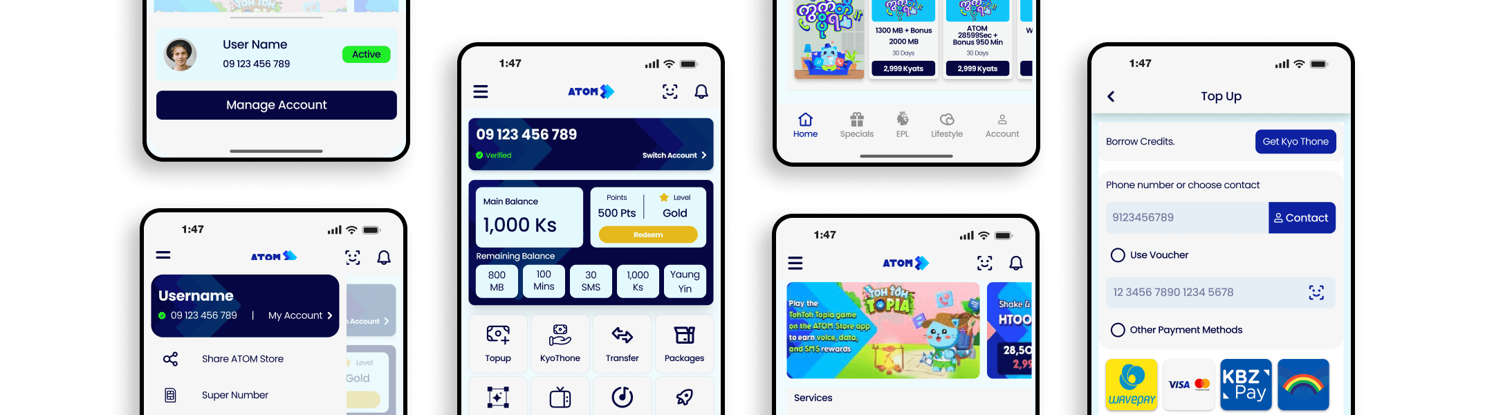
Mid-Fidelity
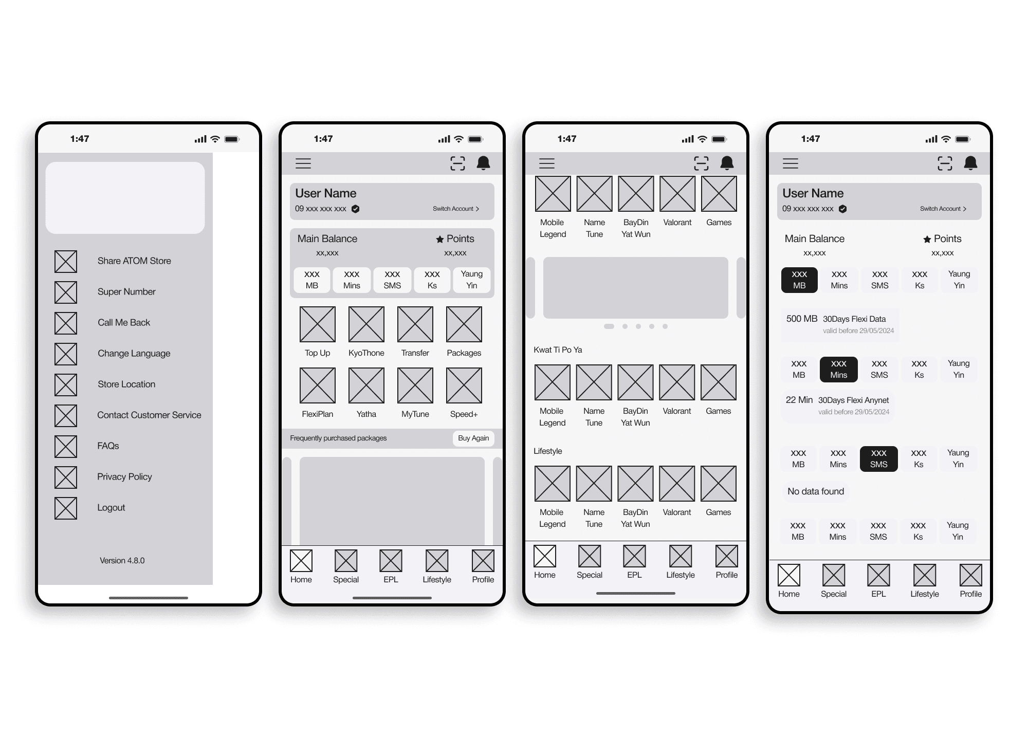
Before moving into visual design, I built mid-fidelity wireframes to validate structure and flow. The focus at this stage was purely on layout how information should be organized, not how it should look.
Key decisions included surfacing balance and points immediately on the home screen, restructuring the navigation drawer to reduce cognitive load, and establishing a consistent content grid for easy scanning.
DEVELOPMENT
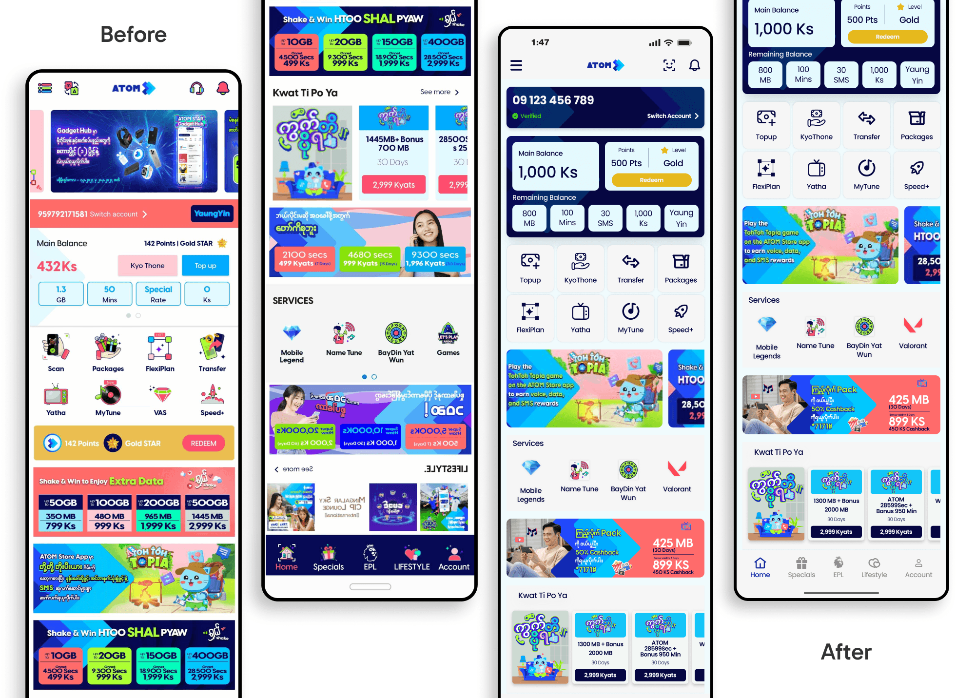
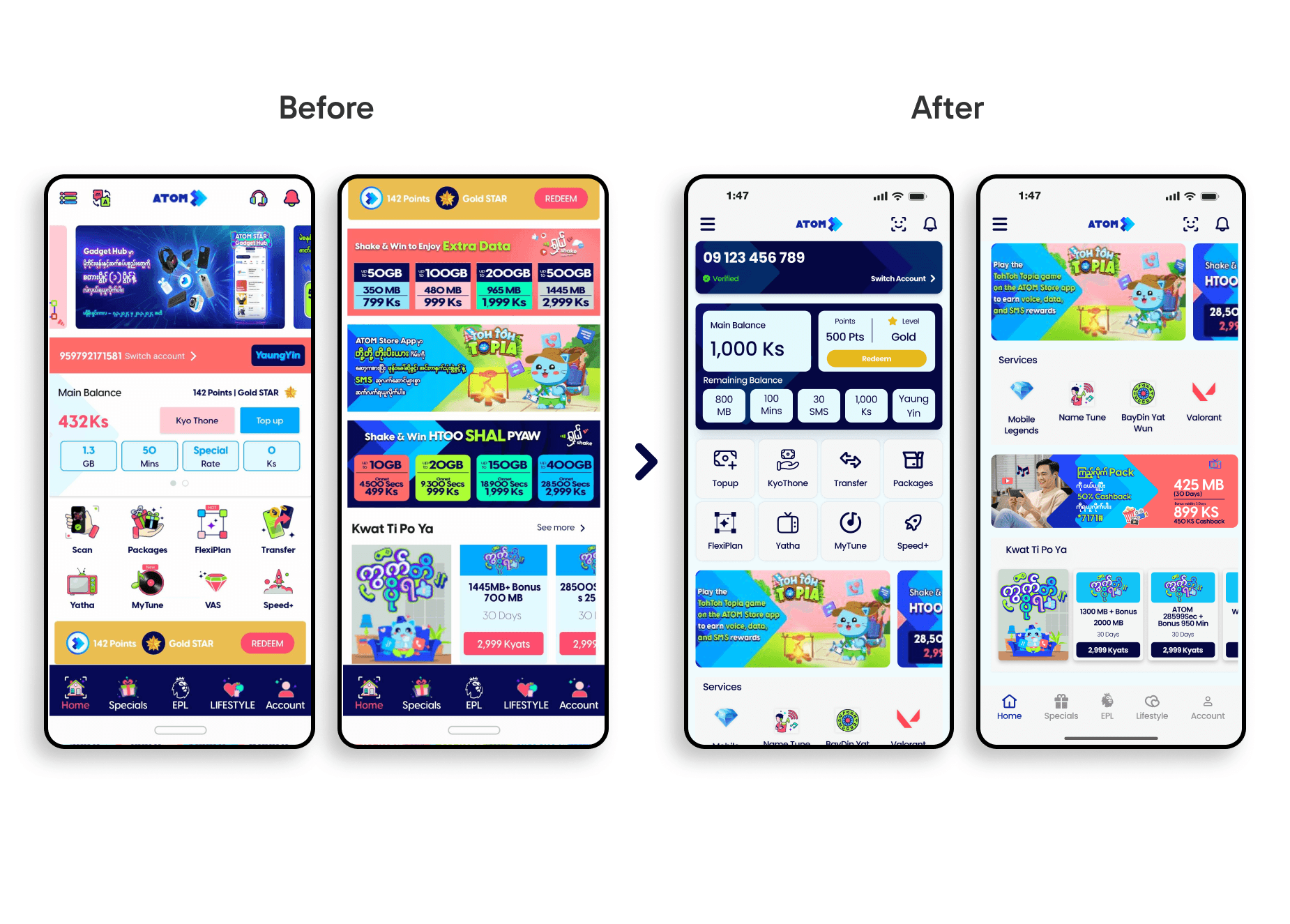
UI Pain Points in the Original Design
The original interface suffered from three core structural issues. Overcrowded menus presented too many options at once, making navigation feel exhausting rather than intuitive. Weak visual hierarchy meant that buttons, labels, and content competed for attention with no clear focal point. Poor button and element sizing created friction on smaller screens and made the app difficult to use comfortably with one hand.
Design Objectives
The redesign addressed each of these directly restructuring navigation around user priorities, establishing a clear content hierarchy, improving touch target sizing for accessibility and comfort, and creating a consistent visual system that makes every screen feel intentional.
UI/UX IMPROVEMENTS IN THE NEW REDESIGNED VERSION
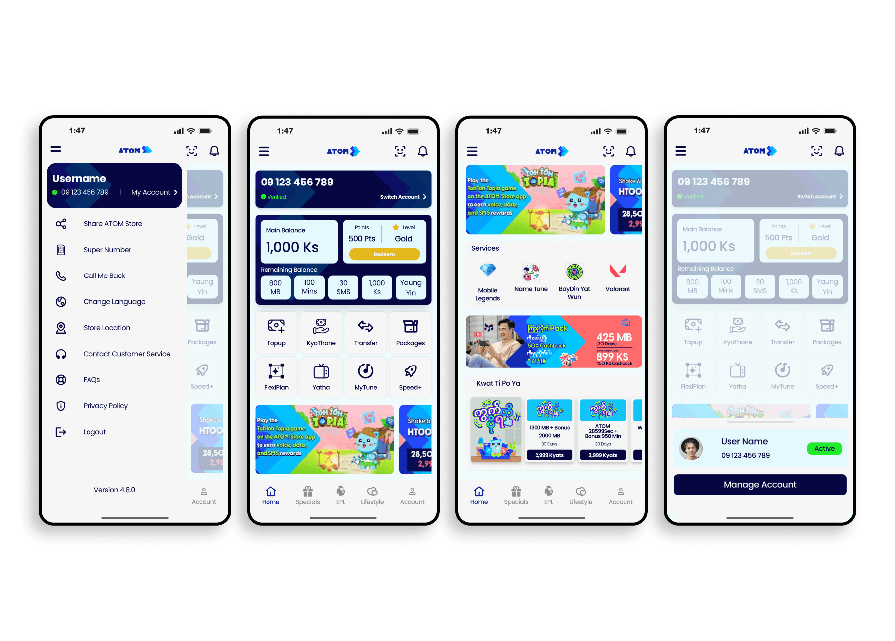
Smarter Navigation Core actions are now immediately accessible from the home screen, eliminating the need to dig through menus for everyday tasks.
Simplified Top-Up The top-up flow was restructured to surface relevant options quickly, reducing the steps needed to complete a transaction.
Structured Content Layout A consistent grid and spacing system creates visual breathing room, making content easier to scan and reducing decision fatigue.
Clearer Visual Language Typography, color, and button styling now work together to guide the user's eye making it obvious what to do and where to go at every step.
Prioritized User Tasks The home screen was redesigned around the actions users actually perform most data balance, top-up, and account management brought forward for immediate access.